Designing for Other People’s Customers

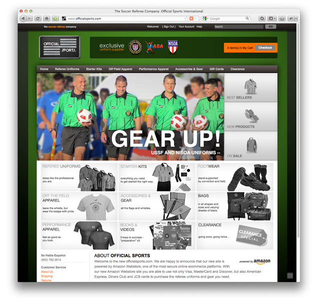
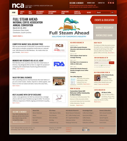
Most companies create their website with user experience in mind—they make it easy for visitors to do what they want—but they miss the opportunity to create a site to guide the visitor into doing what the company wants. The goals of the visitor to a website are not necessarily the same for the visitor and the company. The visitor may be looking for information, doing research for a future possible purchase. The company, on the other hand, wants to make a sale, collect data, or provide a service. How can you turn a website visitor into a customer? Through good design.

Let’s take a look at four main criteria we can use to judge whether a design will aid in turning a prospect into a customer.

Content

  • Is your message clear? Interesting? Does it speak to the visitor?
  • Do you offer clear pathways for the visitor to follow?
  • Do you offer clear calls-to-action to take additional steps? Do you give the visitor multiple options (such as “Learn more” and “Sign up today?”)
  • Is the language appropriate? Is it gender biased? Could it offend?

Experience

  • Is the site easy to navigate? Are terms understandable and unique?
  • Are calls-to-action similar throughout the site? Is like content grouped by function?
  • Is the site responsive? Can it be navigated on phone, tablet desktop?
  • Is the site free of visual clutter? Is content organized in digestible “screens?”
  • Is the site navigable in adverse conditions? The visually impaired? Screen reading?
  • Is the content searchable? Is it well-organized? Tagged? Categorized?
  • Can the visitor make a direct connection to your company?

Technology

  • Is the technology you’re using appropriate for the visitor?
  • Does the site require technology that is not universal?
  • Is the site manageable by your staff in a timely manner?
  • Is it secure?
  • If you’re collecting visitor’s data, do you have a privacy policy that outlines the scope of what you do with the information?

Aesthetics

  • Does the site appeal to your prospect?
  • Are the images appropriate? Unique? Identifiable as your brand?
  • Are the colors and fonts used identifiable as your brand?
  • Do the colors and fonts aid the visitor in doing what you want?
  • Can the visitor scale the fonts (in case of the visually impaired)? Do the colors work for someone who is colorblind? Is it ADA compliant?
  • Do you prioritize information content and flow on smaller devices?

How does your online communication stack up? There are always trade-offs to be made in creating a website. A page that is aesthetically appealing might sacrifice legibility of the content to a certain degree, but in the end the site may be more effective. We call this disfluency.

Disfluency is the act of making something less clear, of slowing down the process of interacting with a page, in order to attain longer interaction and greater retention. Disfluency is just one of the tools we can use to help turn prospects into customers. To find out more, contact Studio 23. We’re ready when you are.


Building a Community, One Mile at a Time

In 2012, the leader of a local fledgling running group, the Leatherman Harriers, would send a weekly email to a group of around 25 runners to coordinate a weekly run, usually on Sundays. When the leader got injured, Studio 23 creative director, a member of the group, volunteered to take over the mailings temporarily.

“Once I started the mailings, I realized that I couldn’t always be counted on to be at my desk to send them when I wanted so I decided to set up a professional email list and allow runners to subscribe and unsubscribe as they wanted. Then, it became clear that instead of handing out maps before the run, it would be useful to allow runners to download their own maps of the course in case they wanted to run at different times. Thus, SundayRuns.org was born.

“The site forms the social hub of the Leatherman Harriers and includes over a hundred course maps, lists of upcoming regional races, postings of the weekly run with map download, helpful tips for running, geolocated course downloads, social media accounts updated weekly, Strava Club board, calendar subscriptions, and the email signup.

“One of the highlights of the week is the group photo taken at the start of the runs which is then posted on Facebook, Instagram, and on the site itself to give potential runners a visual of this excellent group. Since taking over duties, the emails now go out to over 600 runners weekly, we’ve developed several new local trail races, and the group has developed into an accomplished cadre of ultra runners who have tackled some of the most challenging trail races in the world. I look forward to sharing many more miles with them ahead.”

A great example of using online tools to build an offline community. See the site at SundayRuns.org


Monticello Asset Management Connects With New Clients

Monticello Asset Management doesn’t kid around. They knew what they wanted with regard to a website—clean, minimal, easy. They didn’t need a 300-page SEO website to drive customers. They have customers. But what they did need was an online presence to back up the information they’d give out in person. That’s what they got. Investors can access their online accounts through a link, prospects can contact the company for more information, and visitors can get bare-bones information and contact them to learn more.

Now that the site is up, we’re working with Monticello on an ongoing basis developing email campaigns and online ads to reach a larger audience.

Jean-Luc Briguet Launches New Portfolio Website

New York-based architect Jean-Luc Briguet needed a new corporate look that transitioned his company from one name to another. Studio 23 leveraged the classic look we had created for him a few years before and renamed his company, using his name. In addition, we created a fresh new website which highlights the best of his high-end work. Visitors can sort through projects or by room. Since many of his clients need apartment renovations in a room or two, this gives prospective clients the ability to see kitchen or bathroom renovations exclusively.

Since launching, we haven’t seen much of Jean-Luc. He’s been way too busy on those new projects.


Beautyterm is More Than Skin Deep

1200x700_beautytermLogoWhen startup company Beautyterm needed a brand that portrayed their core business—translation services for the beauty industry—they turned to Studio 23. We created an identity for the company that incorporated a traditional editor’s mark in a simple, elegant form. Next, we developed a brand strategy and applied it to their website, using images appropriate for the beauty industry.

While the site was successful at building a buzz in New York and in America, getting good page rank in Paris proved difficult. To help build their business, we created a second site in French using the .fr domain that was able to do the trick. In addition, we applied the identity to their Paris-based company, Beautélogie, and developed marketing collateral to help them get their message out.

Today the company is one of the more successful firms in the industry and we think that’s just beautiful.

Official Sports Kicks Off a New, Secure Store

Official Sports e-commerce website design by Lee Willett / Studio 23

official_sports_webHow important is security to your company? Official Sports hired a developer to create a secure e-commerce store for their soccer referee gear store. Unfortunately, they found that the site had been compromised and credit card data was stolen. That’s when they called Studio 23.We reviewed the situation and developed a game plan. We were able to access the store files, scrub any user data and get the site back quickly as a brochure. We assessed existing e-commerce options and knew that whatever system we would recommend would be very secure but also be recognized as a secure brand by customers. Ultimately, we recommended using Amazon’s webstore platform. We developed a new look and feel to the store to reassure visitors that the store was, in fact, new. We worked with the client in porting catalog records and images into the new platform, creating promotions and a special holiday shop just in time for their annual sale.

By the time the holiday sale concluded, the company saw an increase in sales of 11% over the previous year—an impressive increase considering the circumstances. We’d call that a big win but you be the referee and visit the site at OfficialSports.com.

Studio 23 Launches New Coffee Site

National Coffee Association Website by Lee Willett / Studio 23

ncausa_web2The National Coffee Association of USA hired Studio 23 to redevelop its website that serves the coffee trade as a resource of timely information, events and governmental affair initiatives. The site uses a proprietary content management system with components for member accounts, registrations and store. The original site contained considerable archived articles but distinguishing the archives from the current articles was a challenge to visitors. Also, the original site had limited navigational items and poor organization that inhibited access.

We evaluated the current structure and recommended that we continue to use the existing CMS. While not ideal, changing to a new platform would have been prohibitively expensive and would have required retraining by the organization’s support staff resulting in a loss of time. What we did was to re-architect the site, creating a clear two-tier navigation structure based on areas of expertise. Further, to promote these areas, we developed a rotating masthead that greets visitors with the most important news or events that the organization has to offer. Since the site was performing well with regard to search engine optimization, we made sure that the most visited pages gained in accessibility and older pages moved into archive areas where content was accessible but not primary.

Further, to make the site easily managed, we developed robust style sheets and an image module that is a standard size throughout the site. As a result, one size can be used everywhere thus limiting time creating multiple sizes of graphics.

Since the launch, we’ve watched the site’s visitors grow by 30% and retention increase as well. Check it out at ncausa.org.

Studio 23 Launches Disfluency.com

Disfluency Web Magazine Design by Lee Willett / Studio 23
DisfluencyToday, Studio 23 launched a new site called Disfluency.com which contains bits and pieces of design postings from around the web loosely tied together on the theme of disfluency—the art of making things difficult. Disfluency is a break or interruption in a visual flow of elements. It implies a disjointed nature of elements which can lead to effective or disastrous communications as a result. On the one hand, creating messages that challenge the reader can make those messages more effective and memorable. However, too little structure leads to chaos and anarchy. The right balance is the goal of any good designer. Stay tuned.

New Mobile Sites for Clients

Mobile Website Designby Lee Willett / Studio 23

Along with our usual web design and developement services, Studio 23 now offers custom mobile website design for our clients. Mobile-optimized sites are created to load faster, navigate easier and read better than a traditional site which often requires pinching and zooming to view content.

But is this an iPhone app? No. But that’s a common question. Some clients ask us to build iPhone apps when, really, what they want is a mobile presence. iPhone apps are great but they’re also proprietary and only work on the iPhone, iPod Touches and iPads. Mobile  websites, however, are HTML-based, just like a desktop site, and can be viewed on Apple products as well as Blackberries, Android and Windows mobile phones. The advantages are that development time is faster, visitors don’t need to download a special app through a storefront, updates are made at the same time content on the site is updated, and companies can promote the mobile site just as they do their traditional URL.

While only a fraction of the traffic we see comes from mobile devices, our clients like to think ahead. We’re right there with them.